Your cover is not art. It is a filter.
It has about half a second to tell a scrolling reader three things: this is romance, this is dark, and this is the exact flavor of dark you like. If it misses any one of those, the reader never reads your blurb. Your blurb could be perfect. It does not matter.
BookBub puts a number on this. In their genre breakdown, they report that a cover alone can account for a 30% difference in clicks on a listing. Same book. Same price. Same copy. Thirty percent.
So let’s talk about what is actually working in dark romance right now, and more important, how to find out if your cover is one of the ones losing that 30%.
The Genre Has Hardened Into a Grammar
Dark romance covers used to be all over the place. They are not anymore. The look has settled into a fairly strict visual grammar, and readers now read it fluently.
A 2026 breakdown of dark romance cover conventions lays out the core pieces, and they match what you see on any current release grid:
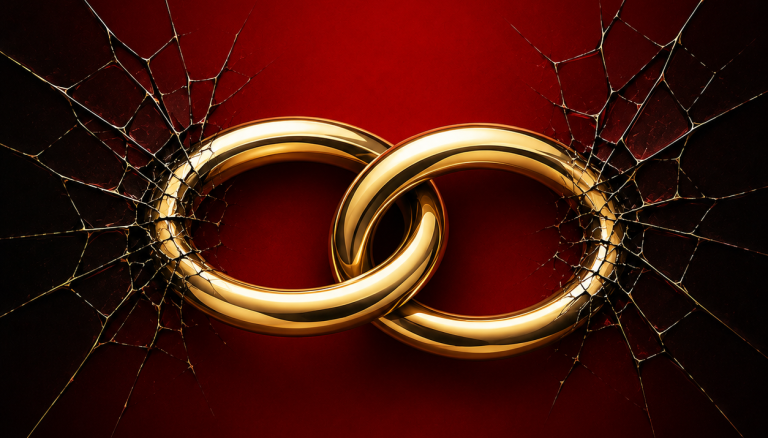
- A true black field. Not navy. Not charcoal with a texture overlay. A void the subject emerges from.
- One saturated red accent. Lips, a dress, petals, blood. One. A second color reads as a different genre.
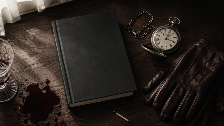
- Symbolic objects over explicit imagery. Thorned roses, masks, daggers, chains, knives.
- Body language that reads as dominance and surrender, not tenderness. If your couple looks like they love each other, you have made a contemporary romance cover.
- Typography that is either refined serif or deliberately damaged caps. A clean geometric sans kills the signal completely.
That last one trips up more indie authors than anything else. A modern sans-serif looks expensive. It also looks like a business book.
Note this is a designer’s read of the convention, not measured sales data. Treat it as a strong pattern, not proof.
What’s Actually Shifting in 2026
Two shifts are worth your attention.
Object covers are eating the man-chest cover’s lunch. Not everywhere, and not for everyone. But a 2026 romance cover trend roundup points to object-based covers as a growing lane, along with the “grit and grunge” textured look that suits brooding antiheroes. The appeal is practical, not just aesthetic. An object cover is easier to advertise, easier to read at thumbnail size, and does not date the way a model’s haircut does.
The illustrated wave has not come for dark romance. It came for contemporary and for romantasy, and it stayed there. One widely referenced 2026 romance cover guide puts it plainly: illustrated styles dominate contemporary and romantasy, while photographic styles still rule historical, dark, and mafia. If you write dark romance and you are tempted by a cute illustrated cover because it is trending, resist. You will be sorted onto the wrong shelf by readers and by the algorithm both.
There is one real exception. Dark romantasy sits on the seam, and a fair number of successful titles there use illustrated or painted-symbol covers with a dark palette. If you write the crossover, you have a genuine choice. If you write contemporary mafia, you do not.
The Discreet Cover Question
Here is a live argument in the genre, and I will take a side.
Some authors now run two covers: the sultry photographic one, and a discreet minimal version with an object or just typography. The discreet cover is easier to read in public, easier to run as an ad, and easier to keep live on a platform that dislikes suggestive imagery.
My take: the discreet cover should be your paperback and ad variant, not your primary ebook cover — unless your subgenre is already discreet-first. Monster romance, dark academia, and gothic titles often are. Mafia and captive titles usually are not. Check the top 40 in your exact category before you decide. Not dark romance broadly. Your category.
The reason to build one anyway is simple. You will need a compliant image the first time you run paid social, and building it under deadline produces a bad one.
Besides ads, another way to put a finished cover in front of the right readers is booking a promo slot with Dark Romance Reads, where listings are sorted by trope and content warning rather than lumped in with general romance.
Stop Guessing. Test It for Twenty Dollars.
This is the part most indie authors skip, and it is the part that actually pays.
You do not have to argue with your designer about whether the red is right. You can find out. BookBub’s guide to testing cover designs lays out several methods, and two of them are cheap enough to run this week.
Polling. PickFu runs a poll at roughly $20 for up to 50 responses, and respondents explain their choice. The written reasons are worth more than the vote count. When ten people say “I thought this was a thriller,” you have your answer.
Ad split tests. Run the same book to the same audience with two covers and compare click-through. The BookBub piece cites a thriller author who found a 17% higher CTR on her redesign using $10-budget test campaigns. It also cites an author whose original cover beat the redesign by 35% on email click-through. That second example is the important one. Redesigns are not automatically upgrades.
Both figures are single-author results reported in a vendor’s blog post. Treat them as illustrations of the method, not benchmarks for your book.
One more claim you will see repeated: that a cover drives roughly 95% of the click decision in romance. I cannot find a source study behind that number, and I would not build a plan on it. The BookBub 30% figure is the more defensible one.
A Practical Cover Audit You Can Run Today
Seven steps. Give it an hour.
- Pull the top 40 in your exact Amazon category and screenshot the grid. Not the whole dark romance list. Your subcategory.
- Shrink your cover to 100 pixels wide and drop it into that grid. Does it disappear? Does it look like it belongs to a different list?
- Ask one person who does not read the genre what it is about. If they say “thriller” or “horror,” your signal is off. If they say “something romantic and scary,” you are fine.
- Check your title’s readability at thumbnail. Script for the whole title is unreadable small. Script title plus clean sans author name is the standard pairing for a reason.
- Count your colors. Black plus one accent plus one neutral. If you have four, cut one.
- Run a $20 poll against one alternative. Read the written comments, not just the winner.
- Build the ad-safe variant now while you are already in the file. Object or typography only, no skin, no weapons pointed at a person.
When a Redesign Is Actually Worth It
Redesigns are expensive in money and in momentum, so use a threshold instead of a mood.
Redesign when your click-through is well below what the rest of your category gets, when readers consistently misidentify your subgenre, when your series covers stopped matching after book two, or when your cover is more than three or four years old and the shelf has moved past it. A professional romance cover generally runs a few hundred dollars, which the same guide above puts around $250 to $600, so this is not a decision you want to make twice in a year.
Do not redesign because you got bored of looking at it. You are the only person who has seen it a thousand times.
And do not redesign book one alone if you have a series. A mismatched set costs you more read-through than a dated cover ever will.
The Short Version
Your cover has one job: sort readers who want your exact book from readers who do not. Everything else is decoration.
Commit to the genre grammar. Pick one accent color. Use symbols instead of explicitness. Build an ad-safe variant before you need it. And test with real readers before you spend real money, because your opinion and your designer’s opinion are both worth less than fifty strangers clicking.
If you write dark romance, you already know the pain of getting buried next to sweet contemporary releases on generic deal sites. Dark Romance Reads exists so your readers can actually find you — filtered by trope, filtered by trigger, no digging required. We’re currently accepting author submissions for site listings and newsletter features. Come say hi — we’d love to get your books in front of readers who are already looking for exactly what you write.